New Digs
by Wayne Thursby
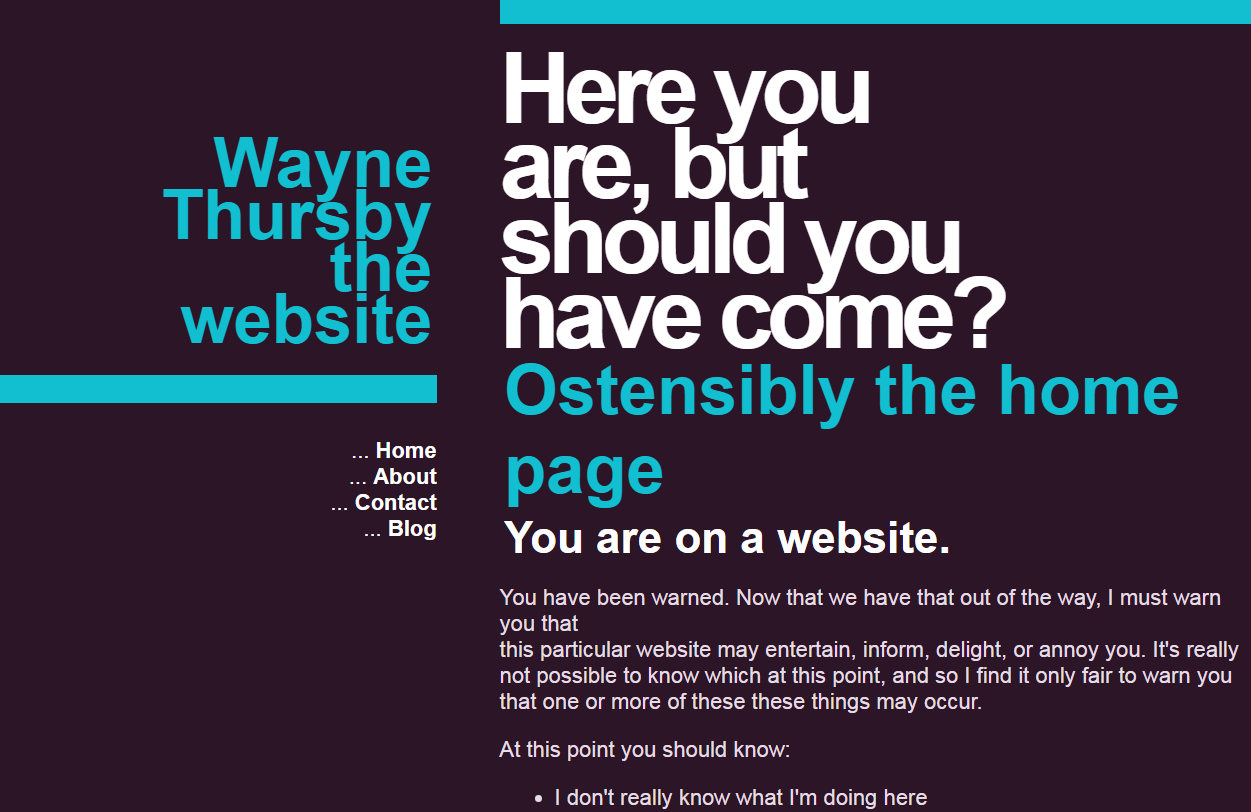
While I do plan on eventually integrating features like comments, searching, and the like, for the short term I'm focusing on having a website that just looks good.
For now I'm not too concerned with things like responsive design, readability, or accessibility. Instead, I'm just playing with the available typography tools and trying to make sense of just how to display textual information on the screen. Images, charts, and other graphics are important, but I feel that text and numbers are often underutilized when it comes to design.
The first iteration of this website is not a design of my own, but instead a modification of the Goliath template from @unahgii. I have merely shifted the color palette a bit, and actually intend on making a user-selectable palette eventually.
